
Tegus: Dark Mode
Designing a dark mode theme
TYPE
Product Design Internship
TEAM
2 designers
2 engineers
TIMELINE
July 2023
TOOLS
Figma
DISCIPLINE
Design Systems
UI Design
IMPACT
This project shipped in Q3 2023.
During the first week of dark mode's launch, 6,070 users logged into Tegus, and
18% switched their theme to dark mode
🏆
This is Tegus’s fastest adopted feature that requires a user-explicit action ever
CONTEXT
Tegus wanted to create a dark mode theme for the platform. The initial dark mode was hastily implemented by inverting colors on the design system's scale. This approach led to numerous issues, as the design system had not been originally constructed with dark mode considerations and many platform components had not been completely updated to align with our latest design system.
I collaborated closely with software engineers to seamlessly integrate a new, user-friendly dark mode.
My goal was to create a visually pleasing and accessible dark mode while ensuring scalability for future enhancements.
★ DESIGN SNEAKPEAK

Before
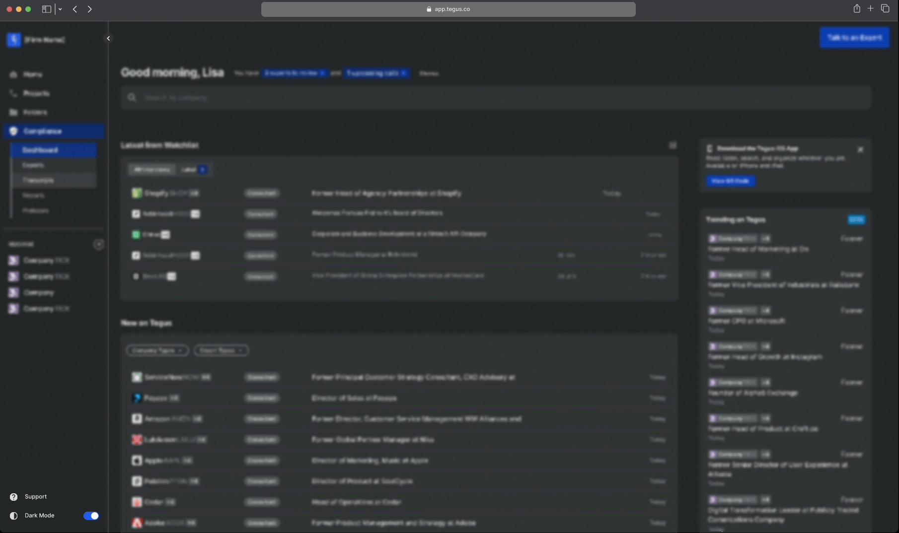
Inverted colors on the design system's scale that was built for light mode
After
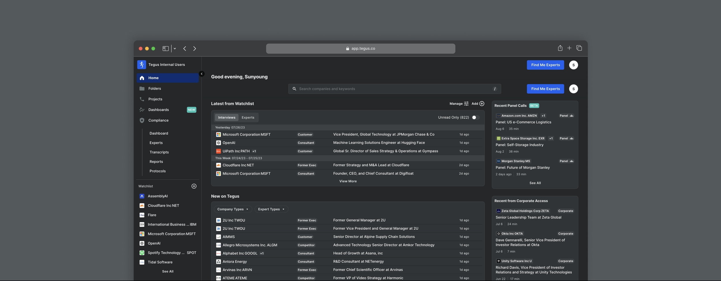
Updated the design system to properly invert to dark mode for all components

THE DESIGN PROCESS
✦ CONDUCTING AN AUDIT
I began by conducting a design audit to identify areas where our initial attempt at implementing dark mode by inverting colors on the design system's scale did not work.
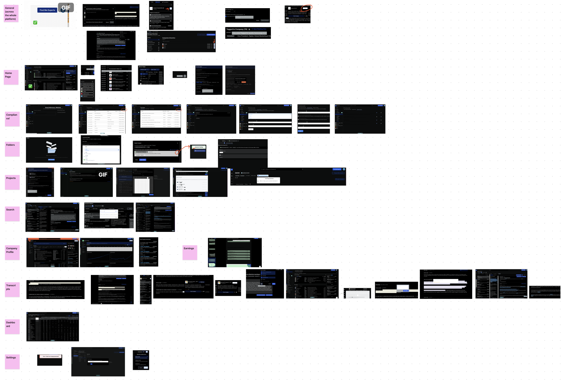
While conducting the audit, the primary issues I came across with the initial dark mode were:
outdated components

poor contrast

lack of depth

✦ UPDATING THE DESIGN SYSTEM
When speaking with engineers, I discovered that creating logic statements for each individual instance and component was unrealistic and highly inefficient. As a result, I needed to revise the design system's actual color palette style to ensure it could properly invert into a dark mode theme that works effectively across all components and scenarios.
Using our design system's existing colors and leveraging my understanding of design principles, I began crafting a new pattern within the design system’s color palette.
🛑 A ROADBLOCK
While creating a pattern to enable all 25 components to function in dark mode, I identified a unique instance where dark mode failed to operate correctly on a single component during the transition from light mode to dark mode.

The table background was too light that it clashed with other components sitting on top of it
Since the engineers were against creating an exceptional case for just one component, I had to explore alternatives to adjust the light mode to ensure its compatibility with dark mode as well.
🟢 SOLUTION
I noticed that my new pattern would prove effective if we introduced a NEW color to the color palette.
This style would be redefined in the code solely for that component, ensuring functionality in both light mode and dark mode.
The updated palette in the design system worked across all 25 components on the Tegus platform.
BEFORE
AFTER


✦ DESIGNING A TOGGLE BUTTON
Now that the dark mode theme had been designed, I needed to allow users to toggle between light mode and dark mode.
The toggle button was placed on the side navigation bar for visibility and easy access.
I needed to design a toggle button
for both the navigation bar’s
expanded and collapsed state.
Things to consider:
The button’s purpose needs to be clear
Must be concise in order to fit in the side navigation
Must use existing components
Needs a distinction when the theme is in light or dark mode
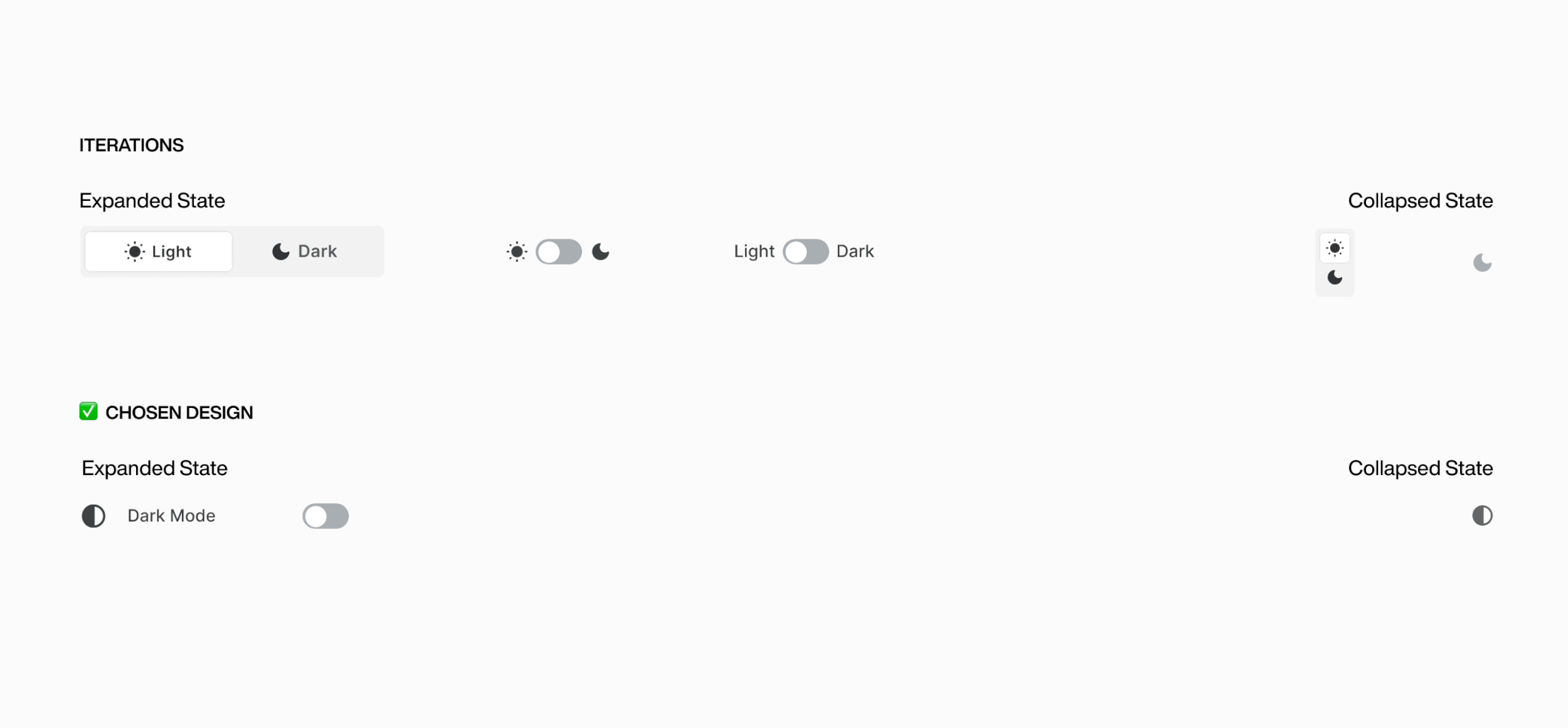
THE DESIGNS

Light mode → Dark mode
LIVE SCREENSHOTS


★
FINAL REFLECTION
✦ WHAT I LEARNED
Effectively collaborating with engineers
This project was already in the development phase when I joined. I had the opportunity to collaborate closely with the engineers working on it, which motivated me to acquire the necessary terminology for effective communication.
The process of updating the design system offered valuable insights into the practical application of color styles and design system components through code. This helped me start understanding the relationship between development and design, gaining insight into the constraints that might prevent certain designs from being developed.
Navigating design systems
This project taught me the technical skills of a design system as I had to navigate its complexities.
I faced the difficulties of matching a chosen color palette across different components. I realized that making sure colors fit seamlessly across all scenarios and parts on the platform is a tough challenge.
SEE MORE PROJECTS