Improving Venmo’s social networking aspects and peer-to-peer transactions
Venmo Redesign
DISCIPLINE
UX Research
UX Design
TYPE
Independent Project
TIMELINE
July 2023
TOOLS
Figma
Context
Venmo is a peer-to-peer mobile payment app that allows users to send and request money. It stands out due to its social networking feature, where public transactions appear on a feed, enabling others to view, comment, and "like" them. This unique aspect draws users even when they don't need to make payments.
How might we enhance Venmo’s social networking features
and improve user-to-user financial transactions?
RESEARCH
01
How are people currently using Venmo??
✦ RESEARCH GOALS
To understand users’ motivations and usage of Venmo, my research goals were:
01. Understand how users are currently using Venmo
02. Identify the goals of Venmo users
03. Distinguish unique features from other banking apps and social networks
04. Identify pain points and frustrations with the app
✦ RESEARCH METHODS
My research methods were:

user tests

user interviews
To observe first-hand what problems users struggle with, I conducted 6 moderated user tests. Additionally, I interviewed 7 users to fully understand how people are using Venmo.
02
SYNTHESIS
✦ PAIN POINTS
Through affinity maps, I identified the 4 main pain points that Venmo users face.

the current Pay and Request buttons
PAIN POINT #1
Confusing buttons cause unintentional transactions
Pay and Request buttons look identical and causes users to accidentally pay when trying to request and vice versa.

which Bob am I trying to pay…
PAIN POINT #2
Hard to find specific users
When trying to complete a Venmo transaction, users are required to input the complete username. Especially with the default username assigned by Venmo including hyphens and numbers, it is challenging to find specific users.
PAIN POINT #3
Forgets about incomplete requests
Money requests that have not been completed lack visibility which makes users forget about them. This leads to uncomfortable reminders and awkward situations with friends.
PAIN POINT #4
Hard to manage friends and blocked users
There isn’t an easy way for users to view their friends, friend requests, and blocked users as they are scattered and not displayed prominently. This makes it difficult to manage Venmo relationships.
03
IDEATION
✦ DESIGN ITERATIONS
Converging to the best final design recommendation involved designing several iterations and making important design decisions based on rationale.
Design Decision #1
In order to remind users of incomplete payments, I asked:
How might users quickly become aware of incomplete payments?

Design Decision #2
On the home screen, I was challenged with:
How might we emphasize the Pay and Request buttons while optimizing user experience?

DESIGN
04
I redesigned Venmo to improve Venmo’s peer-to-peer transactions and social networking elements.
FINAL DESIGNS
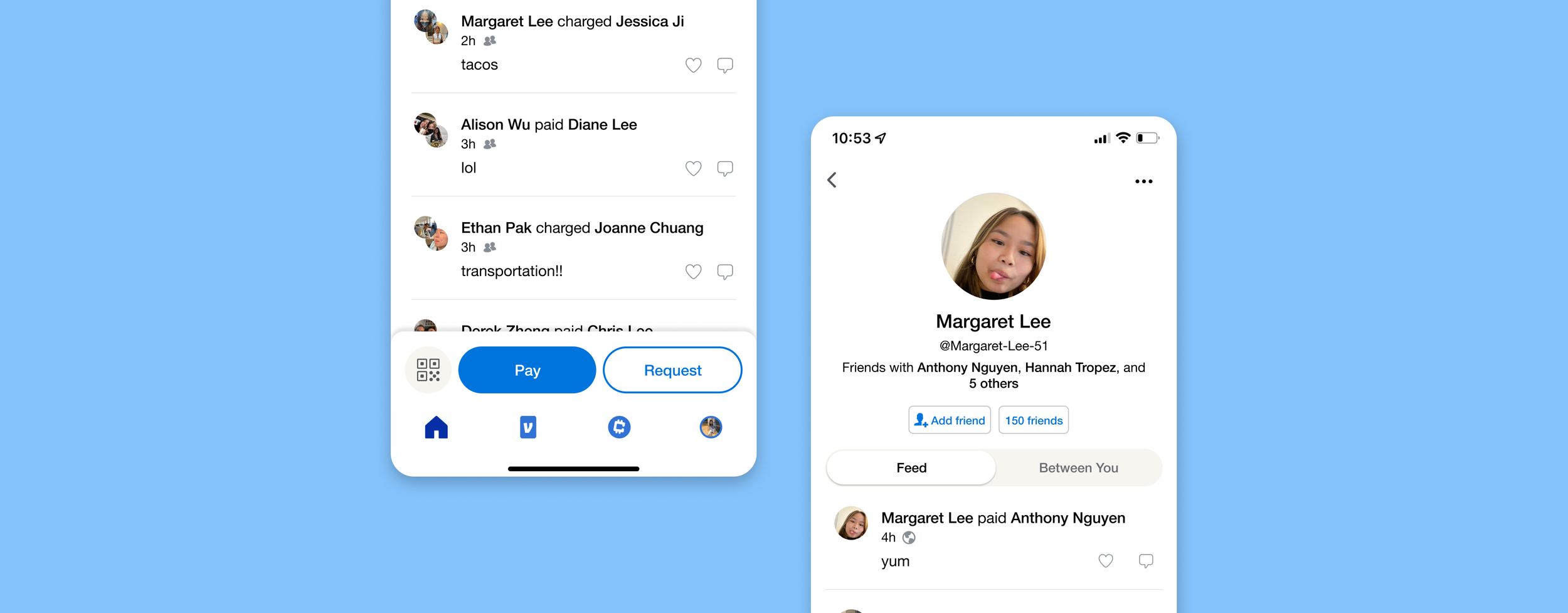
Distinct Pay and Request buttons
☑️ WHAT I DID
Separated the currently combined Pay and Request buttons and visually distinguished them
❓ WHY
The current identical appearance of the Pay and Request buttons cause users to mistakenly do the wrong transaction

MODIFICATION 1 OF 2
☑️ WHAT I DID
Split up the Pay and Request buttons on the home screen
❓ WHY
Clearly distinguishes the two actions to early on to prevent unintentional transactions
MODIFICATION 2 OF 2
☑️ WHAT I DID
Made Pay a primary button and Request a secondary button
❓ WHY
Most Venmo transactions are payments and not requests
Explicit notifications for incomplete payments
☑️ WHAT I DID
Placed the notification center on the top right corner of the home screen with a bright red notification badge
❓ WHY
Immediately alerts users of incomplete payments, preventing them from forgetting to complete their payments

Manage your Venmo relationships
☑️ WHAT I DID
Created a centralized hub for all things related to your Venmo friends.
You can view your current Venmo friends, pending friend requests, contacts from your phone not yet on Venmo (whom you can invite), and any blocked users.
❓ WHY
Despite Venmo having social networking features, users currently struggle when looking for information about their friends and managing these relationships.

Display mutual friends
☑️ WHAT I DID
Allowed users to see other’s mutual friends
❓ WHY
Users struggle to find specific users, and displaying mutual friends can make it easier to recognize a Venmo account

Temporarily block your friends
☑️ WHAT I DID
Allowed users to temporarily block their friends for an hour, a day, and a week
❓ WHY
Puts an end to “Venmo wars”— situations where users engage in back-and-forth payments as they fight over covering the bill— while avoiding the inconvenience of having to unblock the user in the future

✦ RESEARCH INSIGHTS ANSWERED
INSIGHT
Confusing buttons cause unintentional transactions
Forgets about incomplete requests
Distinct Pay and Request Buttons
Explicit notifications for incomplete payments
Manage your Venmo relationships
Temporarily block your friends
Display mutual friends
Hard to manage friends and blocked users
Hard to find specific users
MY SOLUTIONS
SEE MORE PROJECTS