


During the summer, I was a product design intern at Tegus where I designed a scalable dark mode theme.
This project shipped in Q3 2023.
During the first week of dark mode's launch, 18% switched their theme to dark mode, making this Tegus’s fastest adopted feature that requires a user-explicit action ever.
Designing a scalable dark mode theme
DISCIPLINE
Design Systems
UI Design
TIMELINE
July 2023
ROLE
Product Design Intern
TEAM
2 designers
2 engineers
TOOLS
Figma

Overview
CONTEXT
Tegus wanted to create a dark mode theme for the platform. The initial dark mode was hastily implemented by simply inverting colors on the design system's color palette. This approach led to numerous issues, as the color system had not been originally constructed with dark mode considerations.
My goal was to design a visually pleasing and accessible dark mode theme while ensuring scalability for future enhancements.
THE PROBLEM
A simple color inversion on the existing color system is not accessible and a visual design disaster.

…or keep going to see how i got there ⇣
Discovery
CONDUCTING AN AUDIT
I began by conducting a design audit to identify areas where our initial attempt at implementing dark mode by inverting colors on the design system's scale did not work.
The primary issues I came across with the initial dark mode color inversion were:
PROBLEM #1
Poor contrast
The initial dark mode color inversion caused mid-palette lighter colors to invert to other mid-palette light colors, while darker colors at the palette's end shifted to the opposite bright end, leading to contrast issues and inaccessible designs.


PROBLEM #2
Lack of depth
The absence of shadows in the dark mode theme hindered the visibility of component depth, making it challenging to discern the stacking order of components.

PROBLEM #3
Outdated components
Tegus's recent design system overhaul left some parts of the platform unaffected by the dark mode color inversion due to incomplete updates.

UNDERSTANDING TECHNICALITIES
Same assignments, updated colors.
Talking to engineers, I learned that design system components are coded with a specific color style; for example, "button-background" is assigned to the button component. This simplifies the development of dark mode or any new color themes, as the color style assignments remain the same but link to the dark mode color palette.
Therefore, my task was to update the existing dark mode color palette to seamlessly work across all platform components and their existing distinct color style assignments.
Examples of color styles assigned to components

Design System Update
UPDATING THE COLOR PALETTE
Making design choices grounded in my priorities.
Visual Design
Ensure visually pleasing aesthetics through UI design.
Design priorities:
Accessibility
Ensure clear visibility, contrast, and maintain a clear depth order of components.
Placing each component individually against various potential dark mode background colors allowed me to visualize their appearance in different use cases. Through iterative trial and error, I refined the color palette continuously, creating a pattern that works seamlessly regardless of the component’s placement and aligns with both my design priorities.
Testing components on different backgrounds

🛑 A ROADBLOCK
The almost perfect color palette.
While creating a new dark mode color palette that will work across all 25 components, I identified a unique instance where dark mode doesn’t work as expected on a single component.
The Table Component’s color style assignments cause inconsistencies with its background and the components on top in dark mode.
Reassigning color styles exclusively
for dark mode isn't feasible as the assignments works effectively in light mode and on every other component.

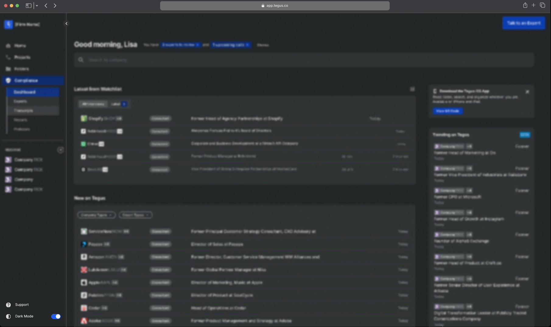
the problematic table component
🟢 THE SOLUTION
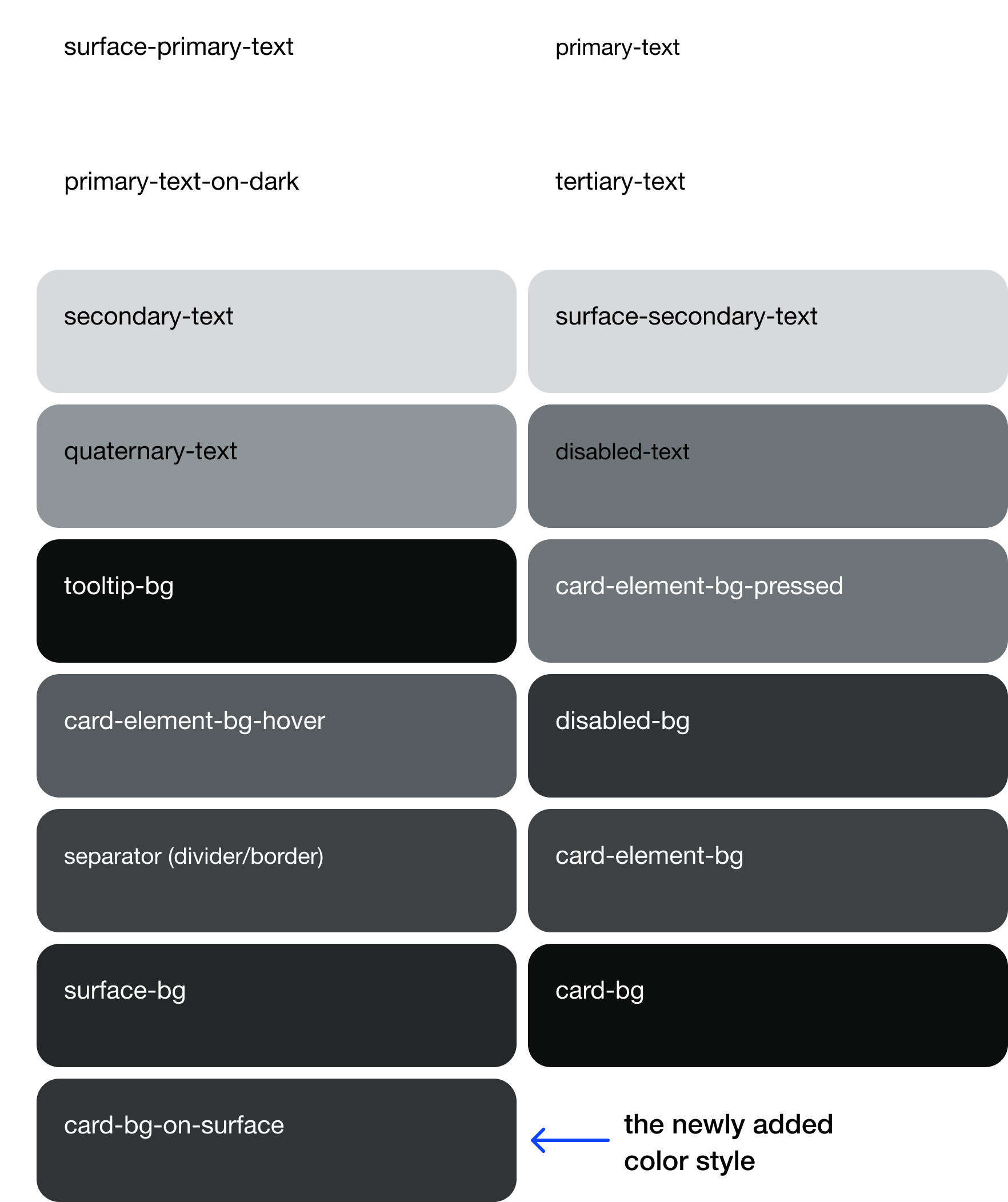
Introducing a new color style.
To ensure scalability in the future and avoid complicating code with exceptions, I've added a new color style to both light and dark mode palettes. This style will be assigned to the problematic table component and all other future components that sit on surface backgrounds.
Color Palette for Dark Mode
before

after
Prototype
DESIGNING A TOGGLE BUTTON
With the dark mode color theme created, I now needed to design a toggle button for users to switch between light mode and dark mode.
The button transforms as the side
navigation bar expands and collapses
Considerations:
Should be concise to fit in the side nav bar
Requires a visual distinction when the theme is in light or dark mode
Needs two versions: one for the expanded state and one for the collapsed state
BUTTON DESIGN ITERATIONS
I designed iterations for both expanded and collapsed states in both light and dark modes, aiming for a clear and concise button.
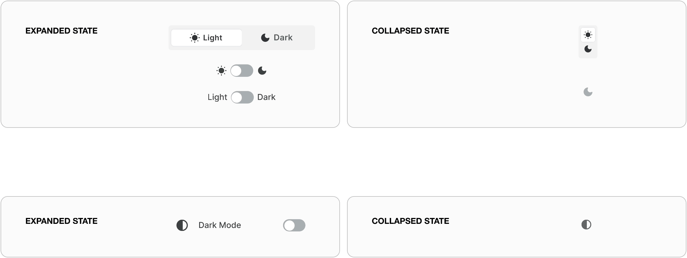
The chosen button design uses a new icon exclusively for dark mode, enabling users to easily associate it with the dark mode feature. Additionally, I prioritized clarity and accessibility by clearly displaying the text "Dark Mode."

A scalable dark mode theme
Final Designs
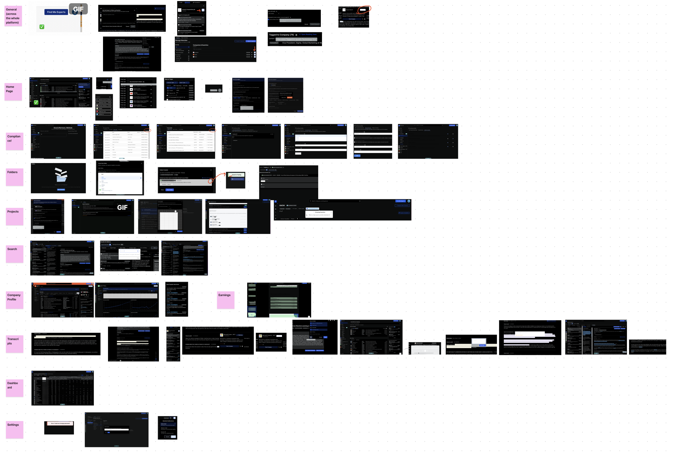
LIVE SCREENSHOTS


Reflection
My internship at Tegus involved a wide range of projects, from conceptual big ideas to technically challenging, tight-deadline projects. This dark mode project had a tight deadline of 2 weeks, forcing me to learn on the go and gain tremendous insights by working closely with engineers.

WHAT I LEARNED
Effectively collaborating with engineers
Close collaboration with engineers taught me technical skills and communication terminology. The technical challenges pushed me to understand of the development-design relationship and potential constraints.
Navigating design systems
This project honed my technical skills in design systems, navigating their complexities. I tackled challenges in matching a chosen color palette across different components, teaching me the complexities of design systems.
Next Project

GoPro
Designing a seamless gifting experience